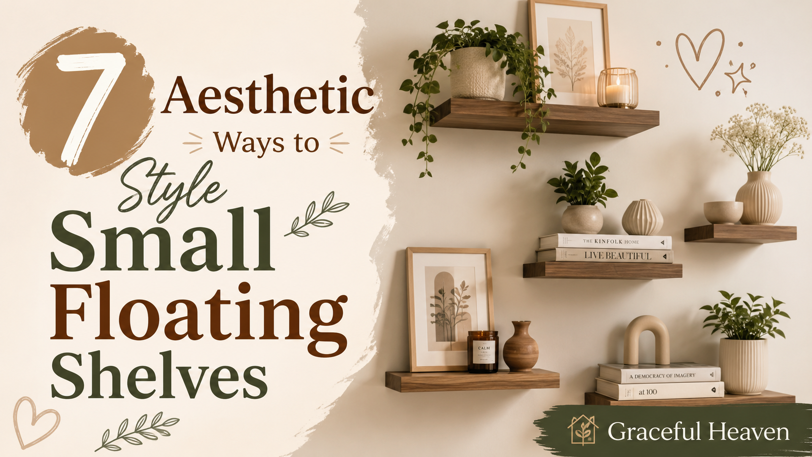
You bought the little ceramic mushroom. You bought the vintage frame, the dried pampas grass, the stack of coffee table books nobody actually reads. 🍄📚 And now they’re all sitting on your bookshelf looking… off. Not bad exactly. Just off. Like a room full of strangers at a party who haven’t been introduced yet.
This happens to almost everyone. You collect pretty things over months, sometimes years, and then one day you try to put them all together and the shelf looks cluttered, or worse, oddly empty even though it’s technically full. 😅
Here’s the thing. Arranging small objects isn’t about having good taste. It’s about understanding a handful of visual tricks that interior stylists use, then applying them with your own stuff. Let’s get into it.
Start With a Clean Slate (Yes, Really)
Before you rearrange anything, take everything off the shelf. All of it. 🧹
I know, it feels like an unnecessary step when you could just shuffle things around where they sit. But trust me on this one. When objects are already placed, your brain gets lazy. You start moving the vase two inches to the left and calling it a day. A blank shelf forces you to think in groups and zones instead of nudging things.
Lay everything out on a table or the floor. Look at what you actually own. You might discover you have five candles and zero plants, or three photo frames and nothing with real texture. This audit step matters more than people think.
Group in Odd Numbers
Designers swear by the rule of three. Sometimes five. Almost never two or four.
Why? Even numbers create a kind of visual symmetry that reads as static, almost too neat. Odd numbers, on the other hand, trick the eye into scanning around a central point rather than settling flatly across the surface. 👀
So instead of placing two candles side by side, try three objects of varying height: a candle, a small stack of books, and a tiny sculpture. Your eye moves between them instead of just landing.
Think about a coffee shop display. The good ones never line up mugs in a perfect row of four. They’ll do three mugs, staggered, maybe one turned slightly. It looks curated instead of stocked.
Play With Height Like You’re Building a Skyline
Flat is boring. 🏙️
A shelf where every object sits at roughly the same height looks like a windowsill lined with knickknacks, not a designed vignette. You want variation — tall, medium, short, tall again — the way a city skyline has skyscrapers next to low buildings.
One easy trick: use books as risers. Stack three or four hardcovers and place a small object on top. Instantly, that object gets promoted. It becomes a focal point instead of just another thing on the shelf.
I did this recently with a small brass elephant I’d had for years but never liked where it sat. Put it on a stack of two books, angled slightly toward the room, and suddenly it looked intentional. Like it had always belonged there. Nothing about the elephant changed. Only its height and angle did.
Mix Textures So Nothing Feels Repetitive
If every object on your shelf is smooth ceramic, your shelf will feel one-note. Flat, even if it’s pretty.
You want contrast. Something glossy next to something matte. Something soft next to something hard and cold. A woven basket beside a glass jar. A rough stone next to a polished brass bowl.
This is where a lot of people get stuck, honestly, because they buy decor items that all match in style. Everything’s minimalist. Everything’s beige. Everything’s the same material. It coordinates, sure, but it doesn’t have depth.
Try this quick mental exercise: imagine touching each object with your eyes closed. Would your fingers feel the same thing over and over? If yes, you need texture variety.
Leave Breathing Room — Negative Space Is Not Wasted Space
This one trips people up constantly. 😮💨
There’s a temptation to fill every inch of a shelf because empty space can feel like a missed opportunity. But packed shelves read as cluttered no matter how nice each individual piece is. Your eye needs somewhere to rest.
Designers call this negative space, and it does real work. It frames your objects the way a mat frames a photograph. Without it, everything blurs together into visual noise.
A good rule: aim to fill about 70% of a shelf, leaving the remaining 30% open. Not evenly distributed empty space either — clustered gaps look more natural than scattered ones. Group your objects on one side or in a loose diagonal, and let the rest of the shelf just breathe.
Anchor With One “Hero” Piece Per Shelf
Every good arrangement has a star. One object that draws the eye first, before anything else registers. Maybe it’s a bold piece of art propped against the back wall. Maybe it’s an oversized vase with dramatic dried branches.
Without a hero piece, everything competes for attention and nothing wins. The whole shelf ends up feeling scattered, like a garage sale table instead of a designed space.
Pick your hero first. Then build everything else around it, smaller and quieter, so it supports the star instead of stealing focus.
For example, say your hero is a large abstract painting leaning against the back of the shelf. You’d want to keep the objects in front of it low and simple — a small stack of books, maybe one plant, nothing too colorful or busy. The painting gets to shine. Everything else plays backup.
Layer Front to Back, Not Just Side to Side
Most people arrange in a single line, left to right, like soldiers standing at attention. But shelves have depth too, and using it changes everything.
Push some pieces to the back. Bring others forward. Overlap them slightly, the way you’d layer clothes in an outfit. A tall vase in back, a small trinket dish tucked in front of it, maybe a mini frame leaning against the vase’s base.
This layering creates something photographs alone can’t capture well but the eye picks up instantly in person: dimension. It’s the difference between a flat photo and a real, lived-in space. 📐
Try this with a plant and a picture frame. Place the frame flat against the back wall of the shelf, then set a small potted plant slightly in front and to the side. Instantly there’s a sense of layers, of things existing in actual three-dimensional space rather than just sitting in a row.
Use Books as More Than Just Books
Your books aren’t just reading material anymore. They’re building blocks. 📚
Stack them horizontally in groups of two or three, then top with a small object. Turn some spines out and some pages out for variety — an all-spine-out shelf can look a little too uniform, almost like a library display rather than someone’s actual home.
Color matters here too. If your books have wildly different colored spines, consider turning a few pages-out to mute the visual chaos, especially if you’re going for a calmer, more neutral look.
Books also solve height problems instantly. Got an object you love but it’s too short to matter next to taller pieces? Stack two books under it. Problem solved in ten seconds.
Don’t Forget Color Flow
Look at your shelf as a whole, not object by object. Does one color show up in little pops across the shelf, or is everything one shade dumped in one corner?
A trick professional stylists use: repeat a color at least twice, but never in identical objects. So if you’ve got a terracotta vase on one side, echo that warm tone somewhere else — a small ceramic bowl, the spine of a book, even a candle. This creates flow without matching everything perfectly, which honestly looks a bit try-hard anyway.
A Quick Scenario to Tie It Together
Let’s say you’re arranging a single shelf with these items: one tall glass vase, a stack of four books, a small framed photo, a ceramic bowl, and a dried eucalyptus stem.
Here’s how that might play out. Stack the books on the left side, three high. Place the framed photo leaning against the wall behind them, angled slightly. Put the vase with the eucalyptus stem on the right side, standing tall and alone, acting as your hero piece. Then tuck the small ceramic bowl in the empty space between the books and the vase, low and simple, almost like a resting point for the eye.
Notice what happened there. You’ve got height variation (books low, vase tall). You’ve got a hero (the vase). You’ve got layering (photo behind books). And you’ve got breathing room, because you didn’t cram a sixth object in just because there was space left. 🌿
That’s basically the whole formula, just applied to five random objects you probably already own.
Step Back and Actually Look
This sounds obvious, but almost nobody does it. Once you’ve arranged a shelf, walk across the room. Sit on your couch. Look at it from the angle you’ll actually see it from every day, not just up close while you’re fussing with it.
Things always look different from a distance. An object that seemed perfectly placed up close might disappear entirely from across the room, or a color that seemed subtle might suddenly pop too much. Give yourself that distance check before you decide you’re done.
Small Tweaks Make Big Differences
You don’t need new decor to fix a shelf that isn’t working. Most of the time, the problem isn’t what you own — it’s how it’s placed. Try moving your tallest item to a different spot. Swap two objects’ positions. Turn something at an angle instead of facing it straight out.
It’s a bit like rearranging furniture in a small apartment. Nothing new comes in, but suddenly the whole room feels different because the relationships between objects changed. Shelves work the exact same way, just at a smaller scale.
One Last Thing Worth Remembering
Your shelf doesn’t need to look like a magazine spread. It needs to look like you — your travels, your weird little finds from flea markets, the mug your kid made in art class sitting next to a vintage camera you found for five dollars. 🖼️
Perfection isn’t the goal here. Balance is. A shelf with a little visual rhythm, some breathing room, and one or two pieces that genuinely make you smile every time you glance at it — that’s a shelf that’s actually working for you.
So go ahead. Clear it off, lay everything out, and start building your little skyline of objects. Give it twenty minutes and a fresh set of eyes. You’ll be surprised how much of a difference just height, grouping, and a little empty space can make. ✨