That one empty shelf on your wall has been staring at you for weeks. 👀
Maybe you put it up with big plans. A little plant, some books, a candle, done. But then life happened, and now it’s just… there. Holding nothing. Doing nothing. Making the whole wall look unfinished.
Here’s the thing: a small wall shelf is one of the highest-impact, lowest-effort design tools you own. It’s not a bookcase. It’s not a media console. It’s a tiny stage, and whatever you put on it becomes the star of the room. That’s a lot of pressure for one 24-inch piece of wood, honestly.
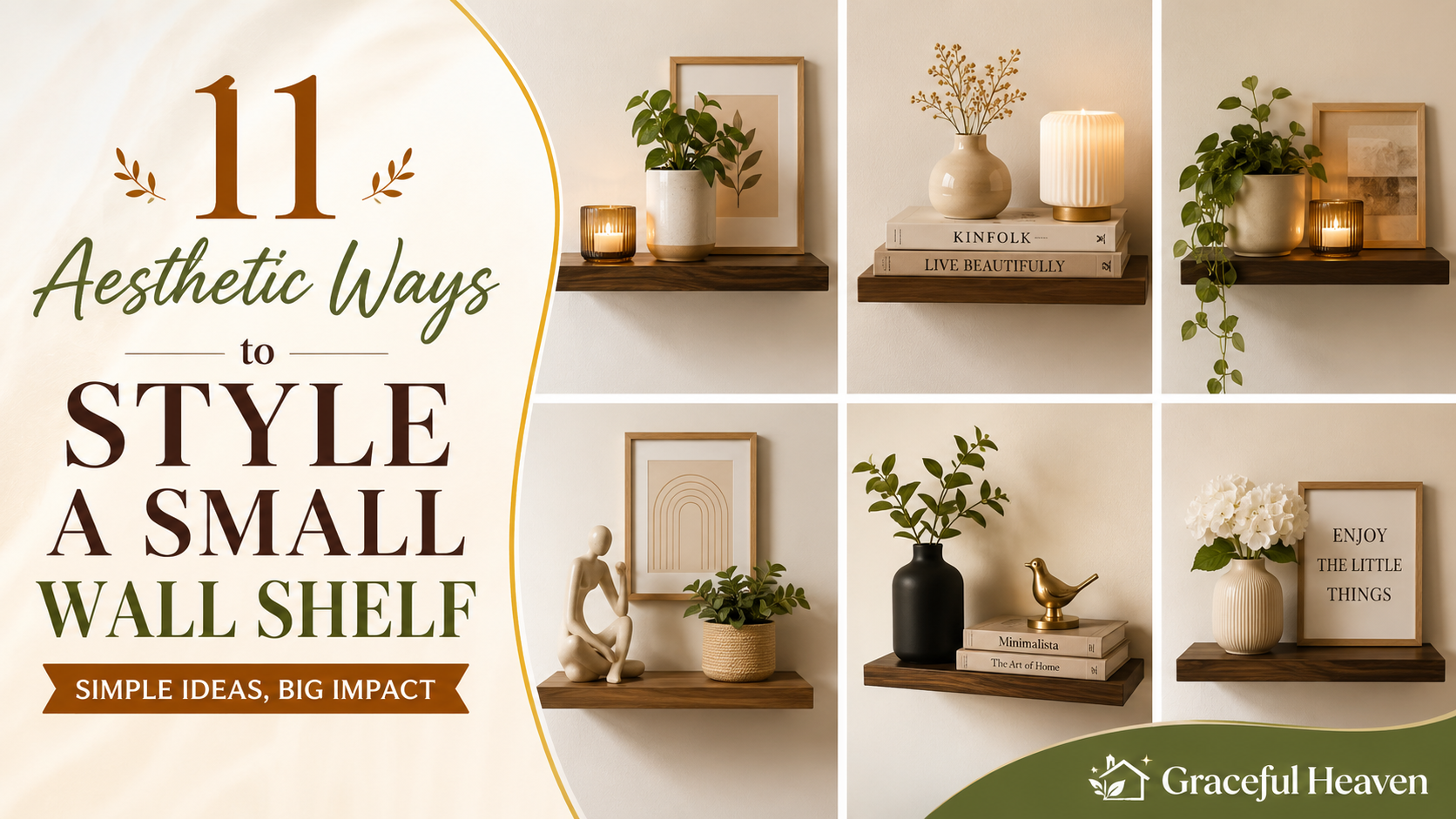
So let’s fix it. Below are eleven ways to style that shelf so it actually earns its spot on the wall — no design degree required, no Pinterest-perfect budget needed either. 🛠️
1. Master the Rule of Odd Numbers
Groups of three feel balanced. Groups of two feel like a leftover pair of socks.
This isn’t some made-up decorating myth, by the way. Your eye naturally struggles to find a “center” in even groupings, so it keeps darting back and forth. Odd numbers give your brain a resting point. A tall item, a medium item, a short item — instantly, the shelf reads as intentional.
Try this: one ceramic vase, one small stack of books, one tiny framed print leaned against the wall. Three objects. Three heights. Done in five minutes. 🌿
Don’t overthink the “rule” part of it either. Sometimes four objects look great if two of them are visually grouped together and read as one unit. The goal isn’t math. It’s rhythm.
2. Play With Height Like You’re Building a Skyline
Flat shelves look flat when everything on them is the same height.
Picture a city skyline. Some buildings are short, some are towering, and that contrast is exactly what makes it interesting to look at. Apply the same logic here. Put your tallest object toward one side — a lamp, a tall vase, a stack of hardcovers standing upright — and let everything else step down from there.
A quick trick: use risers. Old books work as risers. So does an upside-down bowl, or a small wooden block you already have lying around. Slide a smaller object on top and suddenly you’ve got two layers of visual interest where you used to have one flat line. 📚
3. Let Negative Space Do Some of the Work
You do not need to fill every inch.
This trips up a lot of people, especially if you grew up thinking more decor equals more style. It’s the opposite, actually. Empty space — designers call it “negative space” — gives your eye somewhere to breathe. A shelf packed edge to edge just looks cluttered, no matter how nice the individual pieces are.
Think about a fancy restaurant’s plating. The chef doesn’t cover the whole plate in food. There’s white space around the dish, and that space makes the food look more intentional, more expensive, more considered. Your shelf works the same way. Leave a third of it empty. Let the objects you do choose actually get noticed.
4. Anchor It With One “Hero” Object 🏆
Every great shelf has a main character.
Without one, your eye doesn’t know where to land first, so it just sort of wanders and gets bored. With one, the whole arrangement suddenly makes sense. This could be a striking piece of pottery, a small sculpture, a framed piece of art, or even a plant with a lot of personality — something with a bold shape or an unusual color.
Once you’ve picked your hero piece, everything else becomes a supporting character. Smaller candles, a stack of two books, a tiny dish for rings — they all exist to frame the star, not compete with it. If you’re staring at a shelf that feels chaotic, ask yourself: what’s actually the main character here? If you can’t answer that in three seconds, neither can anyone else walking into the room.
5. Mix Textures Like You’re Cooking a Dish
A shelf with only smooth, shiny objects feels cold. A shelf with only rough, matte objects feels flat. You want both.
Think ceramic next to woven rattan. Glass next to raw wood. A smooth marble coaster beside a chunky knit coaster you picked up at a craft fair. This contrast is what makes people want to reach out and touch things — and that instinct, that pull, is exactly what makes a space feel warm instead of staged.
If your current shelf styling feels a little sterile, texture is usually the missing ingredient, not color. Add a woven basket. Add a linen-covered book. Add anything with a little grain or grit to it, and watch the whole vibe shift. 🧶
6. Bring in Something Alive
A shelf with zero living things on it can start to feel like a museum display. Sealed off. A little sad, even.
A small plant changes that instantly. Doesn’t need to be fancy — a pothos in a simple pot, a little snake plant, even a small vase of fresh (or faux, no judgment) eucalyptus does the job. Living elements soften every hard edge around them. They also grow and shift over time, which means your shelf never fully “sets” into something static and boring.
If you’re someone who forgets to water anything — and hey, no shame — go with a hardy plant like a pothos or a ZZ plant. They practically thrive on neglect. Or grab a high-quality faux stem. Nobody’s checking. 🌱
7. Use Books as Both Function and Decor
Books aren’t just for reading. On a shelf, they’re color blocks, height variation, and personality all in one object.
Stack two or three horizontally to create a platform for something else — a small frame, a candle, a tiny object you love. Or stand one or two upright as bookends for the whole arrangement. Either way, books add structure that other decor objects can’t quite replicate.
Here’s a small trick that makes a real difference: turn some spines toward the wall. I know that sounds strange. But if your book covers are a chaotic mix of neon colors and mismatched fonts, flipping a few backward instantly calms the whole shelf down and lets the muted cream-colored pages take over instead. It’s a two-second fix with a surprisingly big payoff.
8. Layer in a Little Personal History
Design magazines are full of gorgeous, curated shelves. But you know what they’re usually missing? You.
A shelf styled entirely from a home goods store can look nice, sure. It can also look like nobody actually lives there. So add something with meaning. A small souvenir from a trip. A photo in a simple frame. A little dish your grandmother gave you. These objects don’t need to “match” the aesthetic perfectly — in fact, when they don’t quite match, that’s often what makes the shelf feel real instead of showroom-staged.
Think about the last time you were in someone’s home and noticed a weird little object with a story behind it. Did it make the space feel worse? No. It made it feel like a home instead of a hotel room. That’s the effect you’re going for here. 📸
9. Vary the Shapes on Purpose
Round objects next to round objects gets repetitive fast. Same goes for a row of straight-edged, rectangular things.
Mix it up instead. A round vase paired with a rectangular book stack and a triangular little trinket dish creates visual variety without you having to add a single extra object. Your eye moves around the shelf instead of gliding right past it, because there’s actually something different to look at in each spot.
A simple test: look at your current shelf and mentally trace the outline of each object. If every outline is basically the same shape, that’s probably why it feels a little flat. Swap one item for something with a different silhouette and see what happens.
10. Color Should Whisper, Not Shout
Small shelves get overwhelmed fast when every object is a different loud color.
You don’t need a strict, matchy-matchy color palette — that tends to look sterile anyway. But picking two or three colors to repeat across your objects (say, cream, terracotta, and a deep forest green) gives the eye something cohesive to follow. It ties everything together even if the objects themselves are wildly different in style or origin.
One easy method: choose a “base” neutral — white, cream, or wood tone — for most of your objects. Then add one accent color that shows up twice. Maybe a green vase and a green book spine. That repetition is what makes a shelf feel curated instead of random, even if you basically just grabbed what you had lying around the house. 🎨
11. Change It With the Seasons
The biggest mistake people make with shelf styling? Treating it as a one-and-done project.
A shelf that never changes eventually becomes invisible. You walk past it every day and stop actually seeing it. But swap out one or two small elements every few months — a pinecone and some dried branches in fall, a small pumpkin candle in October, fresh greenery in December, a bright citrus-scented candle in spring — and suddenly the shelf feels alive again. You notice it. Guests notice it too.
This doesn’t require buying a whole new set of decor every season, either. Keep a small bin of seasonal odds and ends in a closet, and rotate two or three pieces at a time. Small swaps. Big difference. 🍂
So, Where Do You Start?
Don’t try to nail all eleven of these at once. That’s a recipe for a shelf that looks overworked instead of effortless.
Pick two or three ideas that actually match your current stuff. Got a plant already sitting around collecting dust? Great, that’s rule six handled. Have a stack of books you’ve been meaning to display instead of hide? That’s rule seven, ready to go.
Grab everything you’re considering putting on the shelf and lay it out on the floor first. Move pieces around. Take a photo with your phone — it’s a surprisingly good trick, because a photo flattens the arrangement and shows you problems your eye tends to skip over in person. Then transfer the winning combo up to the actual shelf.
Your wall shelf isn’t just storage. It’s a tiny snapshot of how you actually live, one shelf at a time. Go rearrange something today. ✨