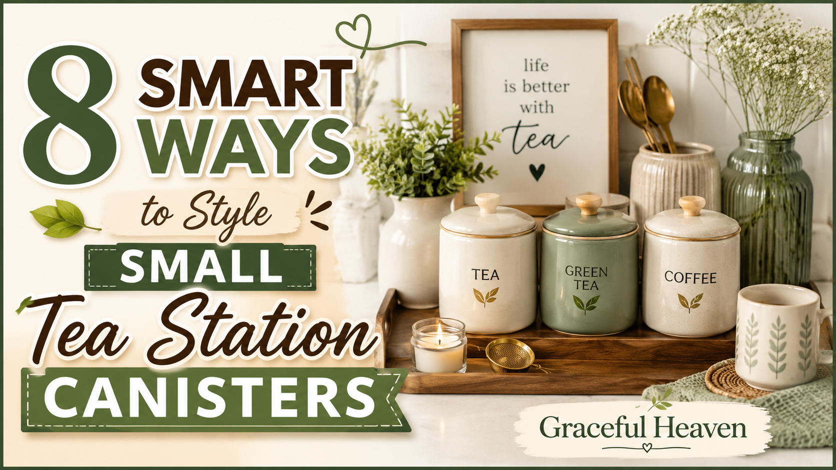
You’ve got a tiny corner of your kitchen. Maybe it’s a shelf, maybe it’s a cart, maybe it’s just twelve inches of counter next to the kettle. And you want it to look like something out of a cozy café, not a cluttered mess of mismatched jars. 🍵
Here’s the thing: small tea canisters are deceptively hard to style. Go too matchy and it looks sterile. Go too random and it looks like a garage sale. There’s a sweet spot, and most people never find it because nobody actually tells them how.
Part of the problem is scale. When you’re styling a big pantry wall or an open kitchen shelf, you have room to hide mistakes. Small tea stations don’t give you that luxury. Every canister is visible at a glance, every label is read up close, every gap or awkward height difference jumps out immediately. There’s nowhere for clutter to hide, which means every choice you make actually counts.
The good news? Small spaces are also incredibly forgiving to fix. You don’t need a full kitchen renovation or a trip to a fancy homeware store. A few smart moves — some free, some costing a couple of dollars — can turn a chaotic little counter into something that genuinely looks curated. We’ve tested a lot of these approaches ourselves, moved things around a dozen times, and landed on eight tricks that consistently work no matter how small your setup is.
So let’s get into it. Grab your canisters, clear off a bit of counter space, and let’s actually build something you’ll enjoy looking at every single morning.
1. Group in Odd Numbers, Not Even Ones 🔢
This one sounds almost too simple to matter. But it does.
Three canisters look intentional. Four canisters look like you ran out of ideas and just lined them up. Odd numbers — three, five, sometimes seven if your space allows — create a natural visual rhythm that your eye reads as “designed” rather than “accumulated.”
Think about it like a bookshelf display. Nobody arranges books in perfect pairs. There’s always a little plant, a frame, something breaking the symmetry. Tea canisters work the same way. Grab three of your favorite blends — say, an Earl Grey, a jasmine green, and a chamomile — and cluster them together instead of spreading them evenly across the shelf.
One quick trick: vary the heights slightly. A tall canister in the back, two shorter ones angled in front. That’s it. That’s basically half the battle won already.
Why does this actually work, though? It comes down to how our brains process visual information. Even numbers split neatly in half, and our eyes register that symmetry as static, almost frozen. Odd numbers can’t split evenly. There’s always one item left over, forcing your eye to move around the grouping instead of settling on a single center point. That subtle movement is what reads as “alive” or “styled” instead of “just placed there.”
Try this experiment in your own kitchen. Line up four identical canisters in a perfectly even row. Take a photo. Now remove one, angle the remaining three slightly, and take another photo. Compare them side by side. Nine times out of ten, the second photo feels warmer, more intentional, even though you technically removed something.
This principle isn’t limited to tea canisters either. Interior designers use it for candle groupings, bookshelves, vases, pretty much anything you’re arranging as a collection. Once you notice it, you’ll start seeing odd-number groupings everywhere, from restaurant counters to Instagram kitchen tours. It’s a small rule, but it carries a lot of weight for something so simple to apply.
If you only own two canisters, don’t panic. Borrow a third object that isn’t even a tea container — a small honey jar, a matching sugar bowl, a tiny vase — to round the group out to three. The eye doesn’t care whether every item technically holds tea. It just wants that odd-numbered rhythm.
2. Let Labels Do the Talking 🏷️
Nobody wants to open five identical canisters just to find their peppermint tea at 6 a.m.
Labels solve two problems at once. First, obviously, they help you find what you need without playing guessing games. Second — and this is the part people miss — consistent labeling instantly makes a random collection of canisters look like a set, even if they’re not.
You don’t need anything fancy here. A simple kraft paper label with the tea name in a clean, hand-lettered style works beautifully. Chalkboard labels are having a moment too, especially on darker canisters where white or gold lettering pops.
Here’s a scenario. Imagine you’ve got three canisters you bought at three different stores, in three different years. None of them match. Slap identical round labels on all three, same font, same placement, and suddenly? They read as a cohesive station. Labels are the great unifier.
Avoid printer labels that peel at the edges after a few weeks of steam exposure near your kettle. Vinyl or laminated labels hold up far better in a humid tea corner.
Let’s talk placement too, because it matters more than people assume. A label stuck dead center on a round canister can look a little clinical, almost like a pharmacy jar. Try positioning it slightly off-center instead, or wrap it around a third of the canister’s circumference rather than flattening it straight on. That tiny adjustment softens the whole look.
Font choice deserves a mention here as well. A thin, serif script feels closer to a French café. A bold, blocky sans-serif feels more modern, more like a specialty coffee shop menu board. Neither is “correct.” What matters is picking one style and sticking with it across every single canister. Mixing three different fonts across five jars is one of the fastest ways to make a shelf look thrown together, even if every individual label looks nice on its own.
Here’s a small scenario worth picturing. You’ve got a guest staying over for the weekend, someone who doesn’t know your kitchen at all. Without labels, they’re stuck opening every canister, sniffing contents, guessing. With labels, they can make themselves a cup of tea without asking you a single question. That’s not just aesthetics anymore — that’s genuine hospitality, and it’s one of those small details guests actually remember and mention afterward.
If you want to go a step further, add the steep time or water temperature to the label. “Green Tea — 2 min, 80°C” turns a simple label into a mini instruction card. It’s a small flourish, but it signals real care, the kind that separates a thoughtfully built station from a shelf where jars just happen to hold tea.
3. Play With Texture, Not Just Color 🪵
A lot of people think styling means picking a color palette and calling it done. Sage green canisters, sage green tray, sage green everything.
That gets boring fast.
Texture is where the real visual interest lives. Pair a smooth ceramic canister with a rough-hewn wooden tray. Add a woven rattan basket underneath for loose-leaf backups. Throw in a linen napkin folded under the teapot. Suddenly your station has depth, the kind that photographs well and, more importantly, actually feels nice to touch every morning.
Metal canisters — brushed copper or matte black — bring a completely different energy than ceramic ones. Mixing metal with wood with fabric is basically the design equivalent of layering flavors in a good cup of tea. Bitter, sweet, floral, all in one sip. Your shelf deserves the same complexity.
Think about the difference between a hotel lobby and a hospital waiting room. Both might use similar colors, similar layouts even. But one feels warm and inviting, and the other feels cold and sterile. Texture is usually the reason why. Smooth, hard, glossy surfaces everywhere start to feel clinical after a while, even if the color palette is technically pleasant. Adding rough, matte, or fibrous textures breaks that coldness immediately.
A quick way to test this in your own space: close your eyes and imagine touching each item in your current tea station. If everything you picture feels smooth and hard — glass, glazed ceramic, polished metal — you’re likely missing texture variety. Add something you’d want to touch. A woven placemat under your tray. A rough linen runner. Even a small stack of cork coasters tucked to the side.
Wood grain is particularly forgiving here because it pairs with almost anything. Light oak works with pastel canisters. Dark walnut works with deep jewel tones or matte black jars. If you’re not sure where to start, a simple wooden riser or small cutting board repurposed as a base is often the easiest single texture addition you can make, and it costs next to nothing if you already have one in a kitchen drawer.
One caution, though: don’t overdo it. Three or four different textures in a tiny space is plenty. Stack on too many — wicker, wood, linen, stone, metal, all crammed into twelve inches of counter — and you’ll swing right back into visual clutter, just a more expensive-looking version of it.
4. Anchor Everything With a Tray 🖼️
This might be the single highest-impact tip on this whole list, and it costs almost nothing.
A tray creates a boundary. Without one, your canisters just kind of… float on the counter, drifting apart, collecting crumbs and stray sugar packets around them. With a tray, everything suddenly belongs together. It’s a frame for a picture that didn’t have one before.
Wooden trays feel warm and rustic. Marble trays feel elevated, almost hotel-lobby chic. A simple galvanized metal tray leans farmhouse. Pick whichever matches your kitchen’s overall vibe, then build your canister arrangement inside that boundary.
One more thing about trays: they make cleaning ridiculously easy. Spilled loose-leaf tea? Just lift the tray, dust it off, done. No scrubbing tea dust out of counter grout at 7 a.m. before work.
There’s also a psychological trick happening here that’s worth understanding. Our brains categorize objects based on proximity and boundaries. Put three canisters loosely on a counter and your brain files them as “three separate objects.” Put those same three canisters on a tray and your brain files them as “one tea station.” Nothing physically changed except a boundary line, but the entire perception shifts.
Size matters more than people expect when picking a tray. Too small, and your canisters overhang the edges awkwardly, looking cramped rather than cozy. Too large, and you get empty space around your jars that makes the whole arrangement look sparse and unfinished. A good rule of thumb: leave about an inch and a half of breathing room around your canister grouping, but no more than that. Enough to feel intentional, not so much that the tray looks half-empty.
If you’re working with a genuinely tiny footprint — think a single shelf in an apartment kitchen — even a small round tray about eight inches across can work wonders. You’re not trying to fit your entire tea collection on it. Just your daily rotation, the two or three blends you actually reach for most mornings. Everything else can live in a drawer or cabinet nearby, ready to swap in when you want a change.
Trays also give you a portable mini station. Hosting friends for tea in the living room? Pick the whole tray up, carry it to the coffee table, and you’ve instantly got a complete, styled setup without scrambling to gather mismatched items at the last minute.
5. Mix Canister Heights Like a Skyline 🏙️
Flat arrangements are visually boring. Our eyes crave variation.
Picture a city skyline. Tall buildings, medium ones, short ones scattered in between — that’s what makes it interesting to look at. A flat row of identical-height canisters is the opposite of that. It’s a parking lot, not a skyline.
So stagger your canisters. Put your tallest one — maybe a big canister holding your everyday breakfast blend — toward the back or one side. Step down from there. A medium one for your afternoon green tea. A short, squat jar for herbal singles or tea bags.
If your canisters happen to all be the same height (this happens more than you’d think, since a lot of sets are sold as matching trios), you can fake this effect with risers. A small wooden block, an upside-down teacup, even a stack of coasters under one canister creates instant variation without buying new jars.
Let’s break down the actual mechanics of why this looks good, because it’s not just an arbitrary design rule. When your eye scans a flat, even-height row, it processes the whole group as one unit in about half a second, and then moves on. There’s nothing to linger over. A staggered arrangement forces your eye to travel — up, down, across — which naturally holds attention longer. Photographers and stylists call this creating a “visual journey,” and it’s the exact same principle behind why a staircase display looks more interesting than a flat shelf.
Picture two versions of the same tea station. Version one: three identical eight-ounce canisters in a perfect row, evenly spaced. Version two: a twelve-ounce canister at the back left, a six-ounce jar in the front center, and an eight-ounce one angled to the right. Same three products, completely different feeling. Version two looks like someone thought about it. Version one looks like inventory on a store shelf.
Risers don’t need to be purpose-built display pieces either. Raid your own cabinets first. An overturned ramekin, a small stack of saucers, even a thick cork trivet can lift one canister just enough to break the flatness. The height difference doesn’t need to be dramatic — even half an inch to an inch of variation registers visually, without anything looking precarious or unstable.
One practical note: if you’ve got kids or pets darting through your kitchen, keep riser heights modest and stable. A wobbly stack under a heavy ceramic canister is a recipe for a shattered jar and spilled tea leaves everywhere, and no amount of styling points is worth that particular Tuesday morning disaster.
6. Let a Plant Sneak Into the Frame 🌿
This one surprises people, but hear us out.
A tiny plant — think a two-inch succulent, a sprig of fresh mint in a shot glass of water, or a small potted herb — softens a tea station in a way nothing else quite manages. Ceramic and metal canisters, no matter how pretty, are still hard, geometric objects. A plant breaks that rigidity with something organic and alive.
Fresh mint is especially clever here because it’s not just decoration. You can literally snip a leaf and drop it straight into your cup. Function and style in one two-inch pot. 🌱
Keep it small, though. The goal is a whisper of green, not a jungle competing with your canisters for attention. One little pot tucked to the side of your tray does more work than you’d expect.
There’s actual science behind why greenery makes spaces feel better, not just design theory. Studies on biophilic design — basically, our built-in preference for natural elements — consistently show that even small amounts of visible plant life reduce stress and increase how much we enjoy a space. You don’t need a home office covered in monstera leaves to get this benefit. A two-inch succulent perched next to your tea canisters is genuinely enough to trigger that response.
If you’re worried about plant care, and let’s be honest, a lot of us are, go with something nearly indestructible. A jade plant, a small snake plant cutting, or an air plant that needs nothing but an occasional mist are all excellent low-maintenance choices for a kitchen counter. Air plants in particular work beautifully here because they don’t even need soil, meaning zero mess anywhere near your canisters.
Fresh herbs deserve a second mention because they pull double duty so well. A small pot of mint doesn’t just look pretty, it actively improves your tea. Snip a leaf, muddle it slightly between your fingers to release the oils, drop it into hot water alongside your regular tea bag or loose leaf. Instant upgrade, and it costs you nothing beyond the initial plant.
Seasonal cut flowers work too, if live plants aren’t your thing. A single stem of eucalyptus in a bud vase, or a sprig of lavender in summer, gives you that same organic softening effect without any ongoing care commitment. Just remember to swap it out before it wilts and starts working against you instead of for you.
7. Repeat a Shape Somewhere Else Nearby 🔄
Design nerds call this “visual echo,” but you don’t need the vocabulary to use the trick.
Basically: pick a shape from your canisters — round lids, hexagonal bodies, whatever — and repeat it somewhere else in the station. Round canisters next to a round tea infuser holder. Square canisters next to a square coaster stack. It’s subtle, but your brain notices repetition even when it can’t name why something “feels right.”
Say your canisters have brass lids. Add a small brass spoon rest nearby. Or a brass-rimmed teacup. That single shared material threads the whole display together without you having to buy a matching set.
This is honestly how professional stylists fake cohesion in fifteen minutes flat. They’re not buying everything from one collection. They’re just finding one repeating element and scattering it around.
Let’s get specific about how to spot your repeatable shape. Walk over to your tea canisters right now and actually look at them, not glance, look. Are the lids domed or flat? Are the bodies straight-sided or slightly curved? Is there a handle, a knob, a ring anywhere? That detail, whatever it is, becomes your thread.
Say your canisters have small wooden knobs on top. You could echo that with a wooden spoon resting nearby, a wooden coaster under your kettle, or even a small wooden bowl holding sugar cubes. None of these items need to match your canisters in color or brand. They just need to share that one wooden element, and your brain will connect the dots automatically.
This trick becomes especially valuable when you’re working with genuinely mismatched canisters, the kind you’ve collected over years from different trips or gifts. Maybe one’s from a market stall, another’s a hand-me-down from a grandparent, a third was an impulse buy at a home goods store. Individually, none of them relate. But find one shared shape or material across all three, even something as small as a similar lid diameter, and repeat it once more nearby, and suddenly the whole group reads as deliberate rather than accidental.
Color can work as your repeating element too, though it’s slightly less subtle than shape. If your canisters all have a hint of blue somewhere, even just in a decorative pattern, a small blue-and-white teacup nearby reinforces that thread without requiring an exact color match. The goal isn’t uniformity. It’s just enough of an echo that your eye stops questioning whether these pieces belong together.
8. Rotate Seasonally, Don’t Just Set and Forget ❄️☀️
A tea station that never changes eventually becomes invisible. You stop seeing it. It’s just there, background noise on your counter.
Swap things out with the seasons and it stays alive. In fall, bring in a small ceramic pumpkin, warm amber-toned canisters, maybe a cinnamon stick tucked in a jar for scent. In summer, lighter linen, pale canisters, a sprig of lavender. Even something as small as switching your label color scheme twice a year keeps the whole corner feeling fresh.
This doesn’t need to be expensive or elaborate. A five-dollar seasonal candle, a different colored ribbon tied around one canister neck, a few dried flowers swapped for fresh ones. Small moves, but they reset how you actually notice your own kitchen.
And honestly? It gives you a reason to actually use your tea station more often, instead of walking past it on autopilot every single morning. ☕
Think of your tea station almost like a small wardrobe capsule. You wouldn’t wear the exact same outfit every single day of the year regardless of weather or occasion, right? Your kitchen corner shouldn’t either. Winter calls for deeper, warmer tones — burgundy ribbons, cinnamon sticks, maybe a small dried orange slice tucked in as decoration. Spring wants pastels, fresh flowers, lighter fabrics on your tray liner.
There’s a practical upside to rotating seasonally too, beyond just aesthetics. It forces you to actually take stock of what’s in your canisters. That half-empty jar of last year’s holiday spice blend, gathering dust in the back? Seasonal swaps are the natural moment to notice it, use it up, or finally toss it and make room for something you’ll actually drink.
A lot of people worry that seasonal rotation means buying a whole new set of decor four times a year, and that’s simply not necessary. Start with one small change per season. A different colored ribbon around a canister neck. A new scent nearby, like a small sachet of dried lavender in spring or a cinnamon stick in autumn. Swap your tray liner from a heavier woven mat in winter to a lighter linen one in summer. These tiny shifts cost almost nothing but keep the whole corner from going stale.
If you want an easy system, set a recurring reminder on your phone for the start of each season. Fifteen minutes, that’s genuinely all it takes to refresh a small tea station. Pull out your seasonal box of extras — ribbons, dried flowers, small ornaments — swap a few pieces, and you’re done until the next season rolls around.
Put these eight ideas together and here’s what you actually end up with: a small corner of your kitchen that feels cared for, not just functional. Odd-numbered groupings that catch the eye. Labels that guide guests and remind you what’s what. A mix of textures that makes the space feel warm instead of clinical. A tray that turns scattered jars into one cohesive station. Heights that create movement instead of flatness. A touch of green that softens all the hard edges. A repeated shape that threads mismatched pieces together. And seasonal touches that keep the whole thing feeling alive instead of frozen in time.
None of these tricks require a big budget or a total kitchen overhaul. Most of them use things you probably already own, tucked away in a cabinet or drawer somewhere. What they do require is a little attention, the kind you’re clearly already willing to put in since you’ve read this far.
So don’t try to do all eight at once tonight. Pick two. Maybe grouping in odd numbers and adding a tray, since those two alone make the biggest visible difference for the least effort. See how it feels for a week. Then come back and layer in another idea, and another, until your little tea corner looks like something you’d genuinely want to photograph.
Your counter, and your morning cup, will thank you for it. 🫖✨